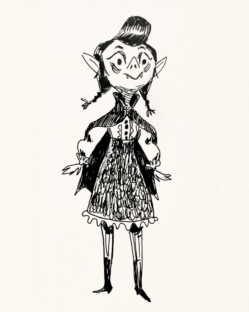
During the last few months of 2017, Federico and I began to develop a story for a comic centered around a vampire girl. We thought it would be interesting to do a few posts about the project to share its journey, both its visual development and our experience in trying to get it published, and talk a bit about the things we learned along the way.
Federico came up with the initial concept for the story, and while the final plot changed quite a bit as we fleshed it out and expanded on it over time, it basically involved the idea of this vampire girl falling in love with a human, and a couple of subsequent events that I’m gonna keep under wraps to avoid spoilers. This early seed of a story gave us a starting point, and as we artists are wont to do, we started making some sketches, drawing and painting in search of our main character, and the mood and feel we wanted for our comic. Many ideas for a story or for its scenes can develop from visual explorations.
The first drawings I ever made of Hématite were these (plus a little sketch of Emile’s head — he’s the human she falls for):


Shortly after, I drew this character, a very early version of what would become Drunela, Hématite’s best friend (and another Emile!):

Drunela was initially just a different kind of vampire (more Nosferatu inspired) but as we continued to develop the universe of this story, we decided she needed to be something else — someone our vampires wouldn’t approve of: a ghoul.
I made a few early mood tests during my #septempera challenge of 2017:


And a couple more during my relaxed #inktober after that. As you can see in the previous images, I was searching for the right animal companion for Hématite, and here I found it! I also started to get closer to the final look of our heroine:


Later I made a quick first style test and drew this little sequence based on the outline we were putting together, but it left us both very unconvinced. I was not happy with the results at all. Federico did the colors for it and it improved some but still — the whole thing felt off:

We concluded that we liked the look of my previous Inktober images more, and switched to inking with a nib. I made this test and we both though that it quite captured the direction we wanted. The coloring style was not right yet but it felt like a solid place to build from.

So much, in fact, that we ended up including an updated version as a panel in the final comic:

And that’s where the thing pretty much took off! By now we had a decent idea of what sort of story we wanted to tell, and the style we wanted for it. We were ready to tackle some *actual pages*!
To be continued in Part II!